UX
Portfolio browsing
Website quality we achieved using Lighthouse
UX
Portfolio browsing
Media
Image-led layout
Brand
Visual identity
PixelPictures is a creative studio in Addis Ababa that sums up its positioning in one line: where creativity meets technology. Its portfolio includes branding and product photography, the kind of imagery made for marketing materials, online stores and promotional campaigns.
For a studio like this, the website is the portfolio. Prospective clients judge the quality of the work by the quality of its presentation, and the previous site was not doing the images justice.
DreamTech was asked to rebuild it so the work leads, the interface recedes, and every featured project opens into its own story. The screens on this page show the redesigned portfolio as our team built it.
The old portfolio felt weak and did not match the studio's premium creative brand.
Creative portfolios are judged at full size. The studio needed its photography shown big enough to reveal detail and texture, the very qualities it sells.
The old layout did not give the photography the restraint a premium studio needs. The new design had to feel as considered as the images inside it.
One photo rarely explains a brief. Visitors needed to see the category, the purpose and the fuller set behind each project.
High-resolution imagery had to stay sharp without making the site slow to open.
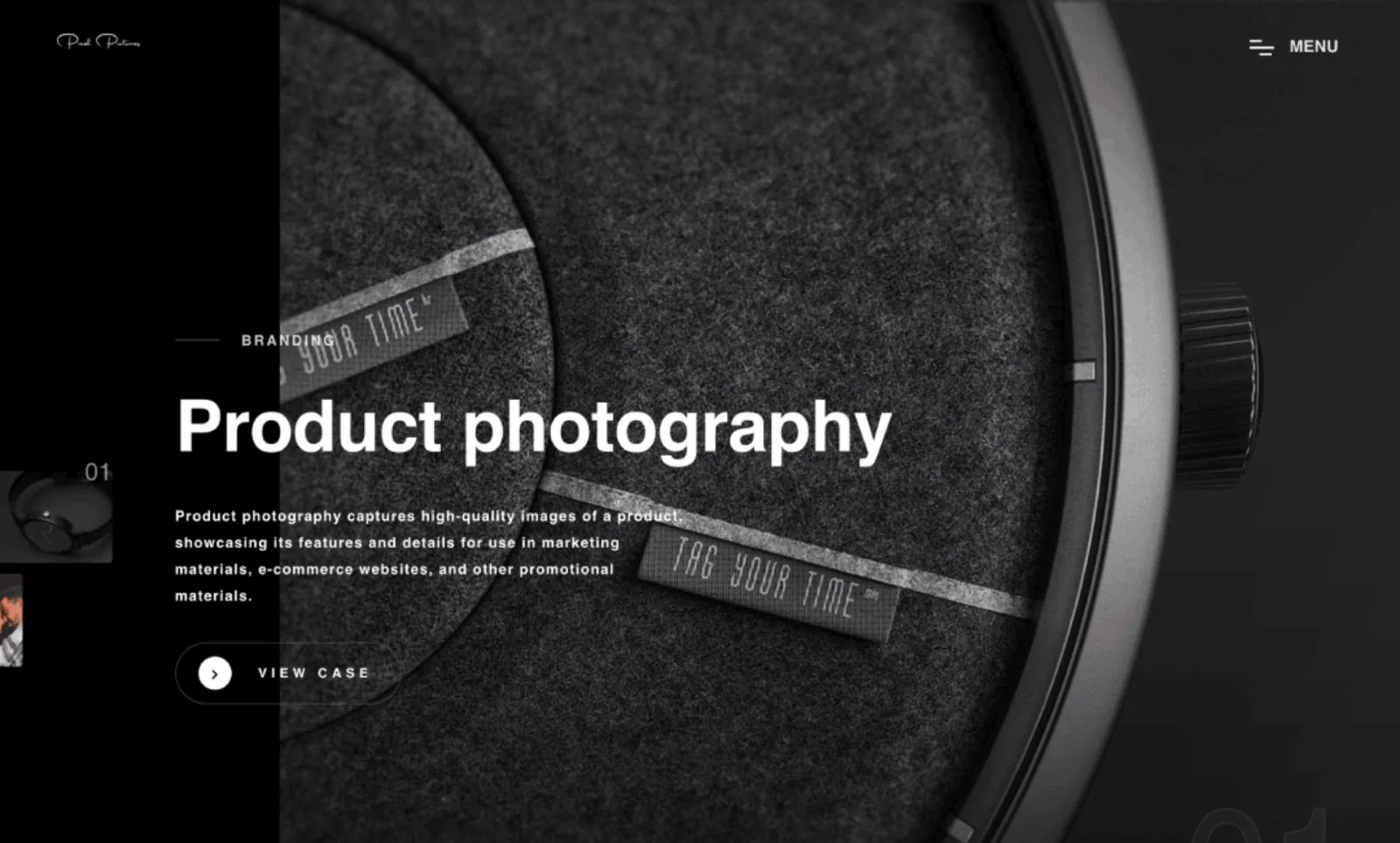
We designed the portfolio the way a gallery hangs a show: one piece at a time, with plenty of dark space around it. The interface uses a near-black, monochrome palette, so the only color on screen comes from the studio's own photographs.
Navigation was moved out of the way. A single Menu control opens the site structure, while the main view is given over to a full-bleed slider of featured cases. Each slide carries just enough text to orient the visitor before inviting them further in.
We rebuilt it with stronger visuals, better storytelling, and a cleaner browsing experience.
The home page is a sequence of featured projects, each filling the viewport with a single image.
A vertical strip of thumbnails along the left edge previews upcoming projects and lets visitors jump straight to one.
One Menu button opens the full navigation, keeping the main view free of bars and links.
View Case opens a full project page where the image set and its context sit together, turning a striking photo into a complete piece of work.
A short list of type styles gives the site an editorial feel without extra decoration.
The case study documents delivered capabilities. It does not present unverified sales or traffic growth as fact.
A clear page hierarchy and adaptable layouts for desktop, tablet, and mobile visitors.
Search-friendly structure, semantic content, metadata, and crawlable navigation patterns.
Optimized media, reserved image space, and lean interaction patterns designed to reduce friction.
Prominent calls to action that guide visitors toward enquiries, downloads, applications, or purchases.
Review the website home page and any additional live pages captured during the latest portfolio review.
The rebuilt portfolio lets PixelPictures present its photography the way it was meant to be seen.
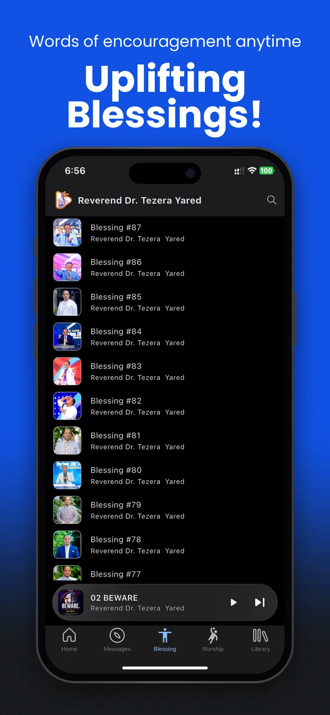
Tezera Yared Ministries needed a focused website for sharing teachings, ministry resources, events, books, and projects. We created a refined, media-led platform that communicates the ministry's story and makes its growing content easier to explore.
We built a sermon and teaching platform for Rev. Dr. Tezera Yared, giving followers organized, on-demand access to messages on mobile and the web.
We built Mezmur, a worship music app that gathers Protestant Mezmur songs in one organized library, with streaming and offline listening.
Questions about your next website project.
Share your goals, users, required platforms, integrations, and launch priorities. The form is preselected for this project type, and you can change it at any time.